Creating your video membership site is one of the most important (and most fun!) steps to take when starting a video membership business.
This is where you get to see all of your planning and hard work come to life. And, with the right setup, your site can be a powerful tool to help you grow your business and delight your members.
But where do you begin?
If you’re looking for a no-nonsense guide to creating a profitable video membership site you’re in the right place.
We cover everything from choosing the right membership site platform to organizing your video content.
Let’s get started!
- Choose the right video membership platform
- Add the basics
- Upload and add your videos
- Create your key pages
- Set up your community area
- Add marketing tools
- Testing
- Launch and listen
What exactly is a video membership website?
A video membership site is a subscription-based platform where creators can host exclusive, premium content for paying members. Think of it as your own Netflix with a built-in community – members pay a recurring monthly fee or annual subscription to access on demand video content, and interact in a private online community of their peers.
You can build a video membership around any subject, from entertainment to fitness and education—no subject is too niche! Take it from the homesteading membership, Abundance Plus, one of the many successful membership sites on Uscreen.

Why creators like you benefit from having their own video membership website
1: Earn recurring revenue
Instead of relying on unpredictable ad revenue or one-time purchases, a membership site provides steady monthly or annual income. This predictable revenue stream allows you to grow a sustainable business and achieve the lifestyle freedom you’ve always dreamed of.
2: Build a loyal customer base
Members who subscribe to your content are more invested in your success. They’re not just casual viewers – they’re committed fans who value your expertise enough to pay for it regularly. This creates a strong foundation for long-term business growth.
3: Provide value to your audience
A membership site allows you to deliver premium, focused content to people who truly want it. You can create in-depth series’, offer exclusive tutorials, and provide a more intimate learning experience by engaging with your members in the community environment.
How to create a video membership website in 8 steps
1. Choose the right video membership platform
Choosing the right platform to build your video membership site is arguably the most crucial decision you’ll make in this process.
To set yourself up for success, you’ll need more than just a basic video hosting platform. A powerful video membership site platform that is specifically built to manage a video membership business can make all the difference, impacting everything from content delivery, to user experience, to your ability to scale.
Here are the 5 must-have features when choosing a platform for your own website:
- A user friendly video catalog: your video catalog should be easy to navigate and provide a seamless viewing experience. It should be flexible enough that you can upload both short and long form videos, and offer options to organize your content through curated playlists and collections.
- A built-in community area: Having a dedicated space to interact with your members and encourage conversation and engagement is an essential part of any membership site.
- Live streaming: Even if your membership is centered around on demand content, live streaming offers a way to build a deeper connection with your members and interact in real time.
- Flexible monetization options: Ensure you can offer different ways for members to pay and access your content, like one-off purchases, bundles, membership levels and subscriptions.
- Robust marketing tools and analytics: Built-in marketing tools make it easier for you to manage your marketing from one central platform. Plus, a native analytics dashboard provides insights that are essential to know what’s working, and for spotting opportunities to improve.
Unsure where to start? We’ve done the hard work for you and analyzed the top nine membership site platforms 👇
Top 9 Best Membership Site Platforms for 2024: A Creator’s Guide

2. Add the basics
Once you’ve chosen your video membership platform, it’s time to open up the website editor and start building. Let’s start with the essential elements:
Add your branding
One of the first things you’ll be asked to do in the web editor is to select your brand color and color scheme. This will influence details like your call to action buttons and links. Your color scheme should match your design assets and be consistent and recognizable throughout your site.
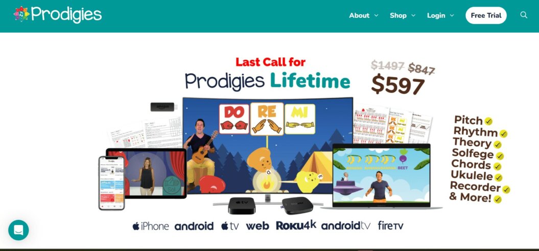
Prodigies’ video membership site is a great example of this. If you look closely at the snapshot of the homepage header below, you’ll spot that all the imagery matches the color wheel in the logo on the top left:
At this stage, you’ll also upload your logo and favicon, which is the little icon that shows in your browser tab and Google search results for your membership website.

You’ll need to have the correct file size and type, and then it’s just a case of uploading the files and pressing save.
💡Top tip: Have your branding and design assets finalized and ready to go before you start building your video membership site. This will save you time and allow you to keep up momentum while you’re setting up your site!
Add your key pages to your navigation
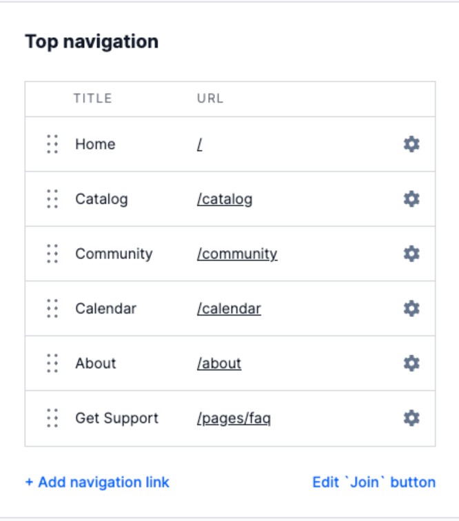
Think of this stage as building your foundation (if your website was a house). In your editor view, you’ll likely have a default list of key pages already added to your site. Which might look something like this:
Your navigation has two layers, the primary and secondary navigation. Your primary navigation is always visible at the top of your website.
Here’s how it looks on Practice With Clara’s membership homepage:

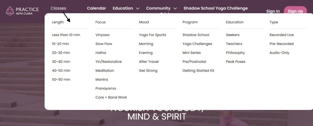
The secondary navigation opens out from these key links at the top, which allows users to navigate to the specific pages in that category.
Like Practice With Clara’s classes:
Your primary navigation should include the essential pages that potential members and existing members will need to access. The key pages to start with are:
- Homepage
- Catalog
- Community
- Pricing or Sign-Up
Your secondary navigation is usually found in your site’s footer area, and is useful for allowing users to navigate to miscellaneous pages across your video membership site, such as:
- Contact Us or Support
- Privacy Policy
- Terms and Conditions
💡Top tip: Put yourself in the shoes of a user visiting your video membership website for the first time. Think, how easy is it to find the key information and access my video content? Are the section titles clear enough to intuitively understand?
Set up your subscription tiers
The exact steps you’ll follow to set up your subscription plans will likely vary depending on your website platform. Here’s how it looks inside Uscreen:
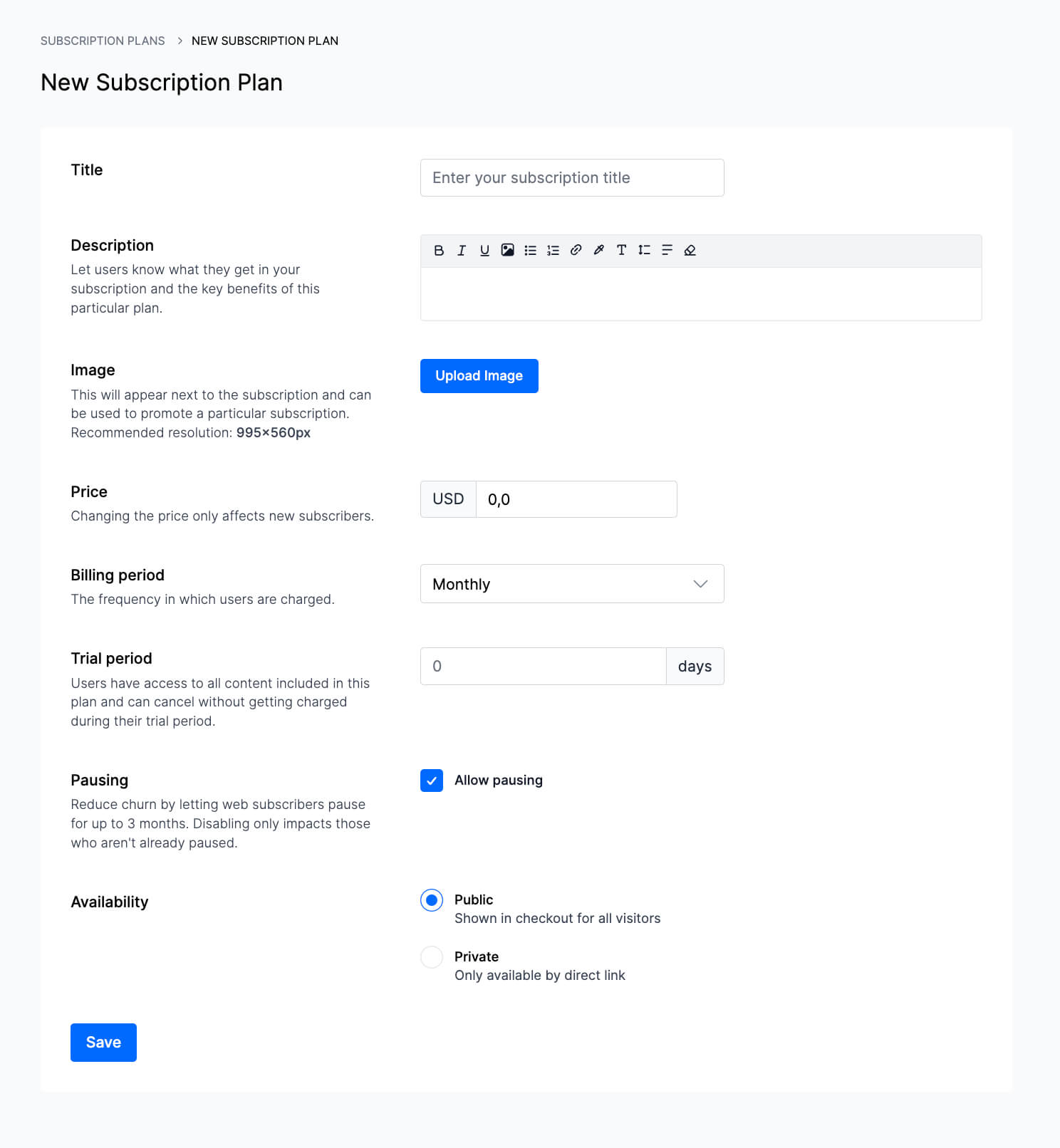
You can add your individual tiers by clicking on the ‘New plan’ button where you’ll follow the steps to set the price, duration, who can access it and the name.
The next step is to assign which content you want to include in each tier. For example, if you offer online courses for beginner, intermediate and advanced users, you can group these together by selecting the relevant videos you want each membership tier to have access to.
Set up payment providers
These are essential so you can accept payments quickly and securely. For recurring payments, Stripe and PayPal are the most widely used payment processors, so we’ll focus on setting those up for the time being.
To set up Stripe:
Once you’ve created a Stripe account:
- In your website editor, find the ‘payment providers’ options in your settings
- Navigate to the Stripe option
- Follow the prompt to connect your Stripe account
- Once approved, enter your login details to confirm your account connection
💡Pro tip: Stripe Radar is a tool we’d highly recommend using which is designed to detect fraud. Visit our help article for more details on how to utilize it from your Stripe account.
To set up PayPal:
First, you’ll need a PayPal Business account so make sure you’ve got that set up with PayPal before you begin.
- In your website settings, navigate to ‘payment providers’
- Find and click the option to connect to PayPal
- Enter the email address and password for your PayPal account to log in
- Agree to the terms and conditions
The processing time for connecting is usually between 2-12 hours. PayPal might ask you to verify additional information, so follow the instructions they provide you on the screen.
Now that your video membership site is set up to process payments for membership subscriptions, let’s move on to the video content itself…
3. Upload and organize your videos
Before you start uploading your videos, make sure your video files are an appropriate size. If they’re too large, they use up more bandwidth and can impact the playback speed for the user—aside from taking forever to upload.
Here are the compression and encoding guidelines we provide our customers to ensure the best video quality:
- MP4 video format
- 1080p/2K or smaller
- H.264 video codec
- 20 fps – 60 fps
💡Pro tip: Break up large video files into a collection and avoid uploading files larger than 13GB at a time to avoid transcoding issues, uploading delays and slow load times for your users.
Add descriptions
You have a few short lines to grab your users’ attention and entice them to click onto your video, so make this count. Your video descriptions should summarize what the video is about, and what users can expect to get out of it.
Take a look at this example from etchrstudio:

The title ‘Introduction to Ink’ is very clear, and users immediately understand what this video collection is about.
In the longer description it explains what the videos will cover, by whom and paints a picture of the end result that subscribers can expect to achieve. It also makes it clear who this video series is suitable for, which users can see at-a-glance before committing to reading the full description.
Use thumbnails that align with the rest of your branding
Your video thumbnails are the first thing people see before clicking onto your video content. While we’re all familiar with the cliche advice ‘don’t judge a book by its cover’ we know that people do it anyway.
You want your thumbnail to be eye-catching and communicate what the video is about at-a-glance to improve your click-through-rate and views.
Here are some dos and don’ts:
✅Ensure the design reflects your branding by adding your logo
✅Make it engaging by including people’s faces, colors and icons
✅Ensure it’s the ideal size (1280×720 with a minimum width of 640 pixels)
✅If you’re adding a title to the thumbnail, use big, bold text to make it easy to read
👀Looking for more tips on creating eye-catching thumbnails? We’ve got you covered
Creating an easy-to-navigate catalog
Now you’ve tackled the basics for uploading, the next stage is to organize your video content to make your catalog easy to navigate.
Think of your categories as genres, for grouping together videos of the same theme. This could be by subject matter, focus or content type. For example, Broadway Dance Center Online’s catalog is organized by dance style:
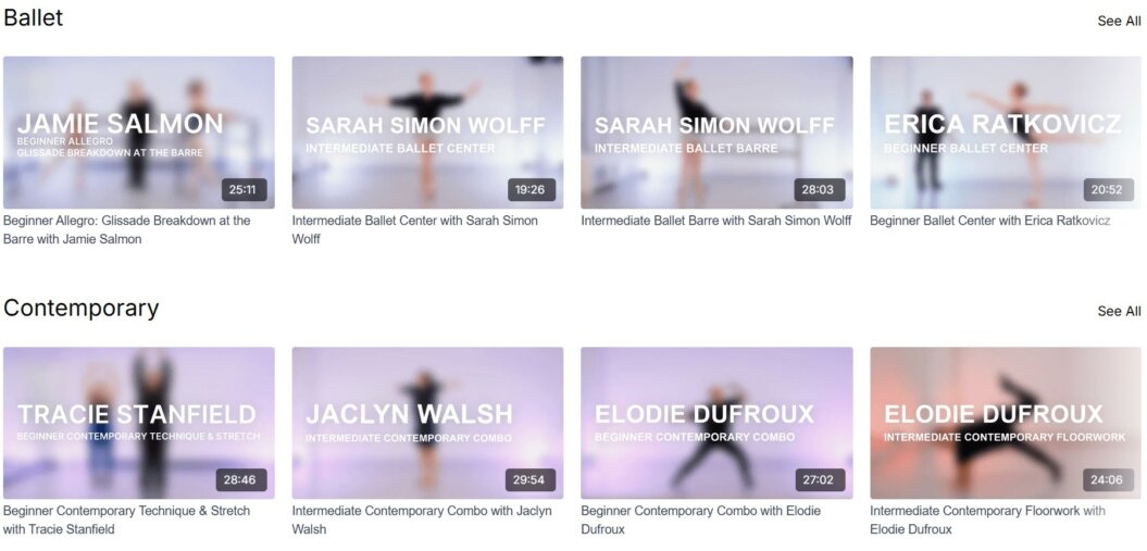
Consider what’s going to be interesting or useful to your users. While the above example appeals to dancers who want to focus on their favorite style or technique, content that’s focused on practical subject matter, like DIY, might be better organized by skill type or rooms in the home.
You can drill things down further by creating collections, which groups together a series of videos to be watched in a particular order. Fittest Core’s bundle programs are a great example of this:

Each of these collections offers a dedicated program for users to follow over a set period of time. It’s perfect for courses and organizing videos that are teaching a particular skill, helping users to build on what they’ve learned in each video and reach the end goal.
Next, let’s move onto adding the detail to your web pages to make the front end of your membership website come to life…
4. Create your key pages
Homepage
Your homepage is the most important page on your video membership site. It’s likely to be the first thing users see when they come to your website so it needs to give a good first impression and clearly communicate what it’s about, and why visitors should care.
The copy on your homepage should communicate the unique value your membership is offering, so it’s important to spend time getting this right in a way that speaks directly to the needs of your niche audience.
The 4 key elements you should include on your homepage are:
- Header sections: Your main heading needs to communicate what your website is about at-a-glance. It should be short and attention grabbing, conveying your brand’s tone of voice. The subheading should expand on this—think of it as your elevator pitch. Connect with your target audience’s pain points here to create a description that evokes an emotional response and entices them to read further.
- Benefits: Showcase how your membership benefits your users by focusing on the end results. Touch on the pain points it helps to solve and why users should choose your particular membership to overcome them.
- Calls to action: Your homepage is like a map to the rest of your site. Provide plenty of calls to action so that users can easily navigate to key pages and find what they need. Think about the user journey in the overall layout and make it as straightforward as possible.
- Imagery and branding: Your homepage should be distinctive and easily recognizable as your brand. Clearly display your logo at the top and include high quality branded images that show your video membership in action. They should serve a purpose and tell the user a story.
Let’s look at Art For Kids Hub’s homepage as an example:
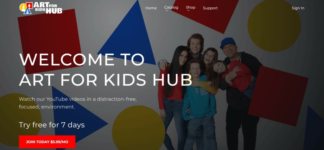
In the header, it clearly introduces who they are and what they offer for their target audience. The main image shows us who they are in a fun, family friendly shot with colorful shapes that match the brand logo. It also gives a clear call to action and offers links to navigate to key pages.
If we scroll further down, it gives a snapshot of the video content that’s on offer, so users immediately understand the subject matter, style and length of the lessons:

💡Pro tip: The most common way for people to scan information online is in an ‘F’ shape, so put the most important details in the top left of the screen.
Pricing page
Your pricing page needs to clearly showcase what membership options are available, the cost, and what members will get with each tier.
The 5 key elements to include are:
- Titles: For each option, keep it simple and consistent so they’re easy to understand at-a-glance.
- Pricing: State clearly how much it’s going to cost and how often this is billed.
- What’s included: List what members get with each option, and highlight what differentiates each pricing tier.
- Thumbnails: Use an eye catching design that’s reflective of your brand to emphasize or add detail. Adding titles like ‘best value’ or ‘most popular’ helps to increase your click through rates.
- Call to action buttons: These should be easy to navigate to and incite users to click and take action.
Here’s an example from Filmmakers Academy:
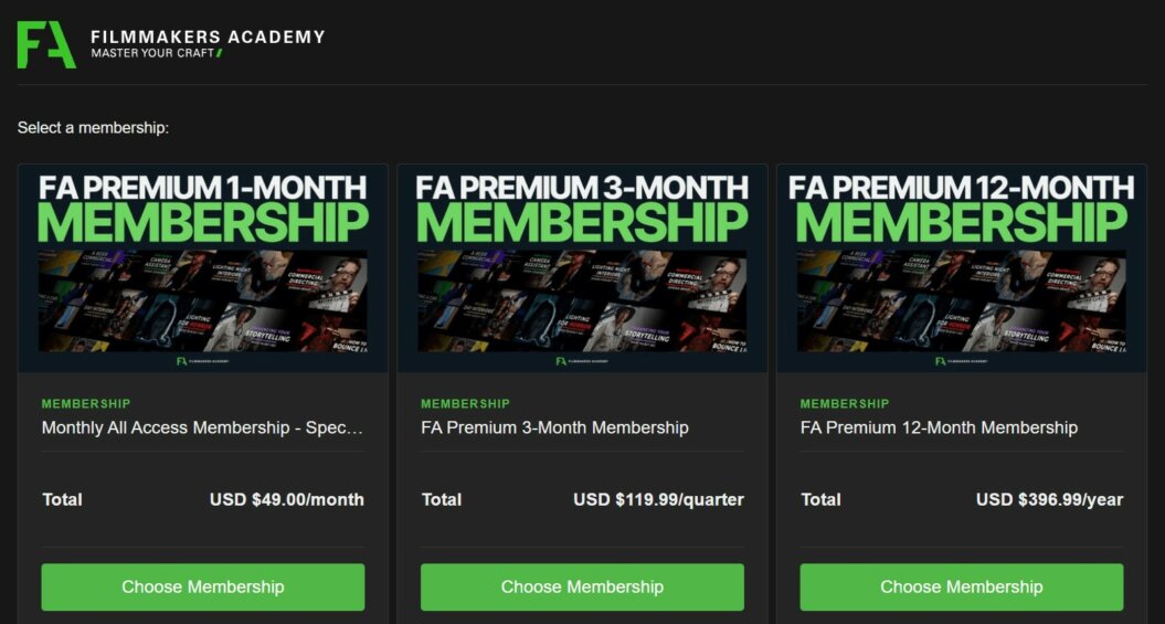
The page tells us upfront what the pricing tiers are, and the cost and duration of the membership plans. Then, if we expand the tabs further, the details are clearly listed underneath:
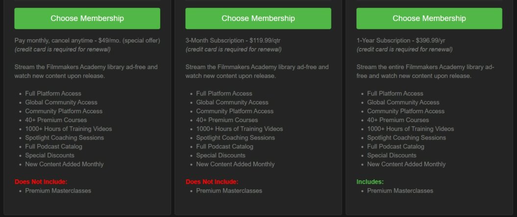
As you can see, they’ve differentiated the 12-month membership from the others by highlighting that it includes a premium membership while the other two don’t, making it feel like a more attractive option.
Terms and conditions
A terms and conditions page is an essential requirement for any website that supports online payments. It’s a requirement from payment processors, but it also protects you from legal liability.
You’ll need to include the following key information:
- Effective date
- A clear definition of what you’re selling and the agreement between you and your members
- Subscription and payment terms and conditions
- User guidelines and expectations for interacting in the community (including what’s not acceptable)
- Cancellation policy
- Privacy policy
- Relevant disclaimers and no-liability clauses
- Contact details
- Amendments to the agreement
- Governing laws
- Refunds and account termination
- Links to key policies
You can use a free tool like Termly to generate a template with all the essentials that you can edit to make it specific for your membership terms.
Now that you’ve got the legal part of your video membership site covered, let’s focus on creating your community space 👇
5. Set up your community area
To set up your community so that members can start posting and engaging right away, you’ll need to activate this feature from your admin area.
Navigate to the community tab in your dashboard and review the settings. It might vary depending on which platform you’re using, but you should see options to activate it and customize who can see it.
Here’s how it looks on Uscreen:
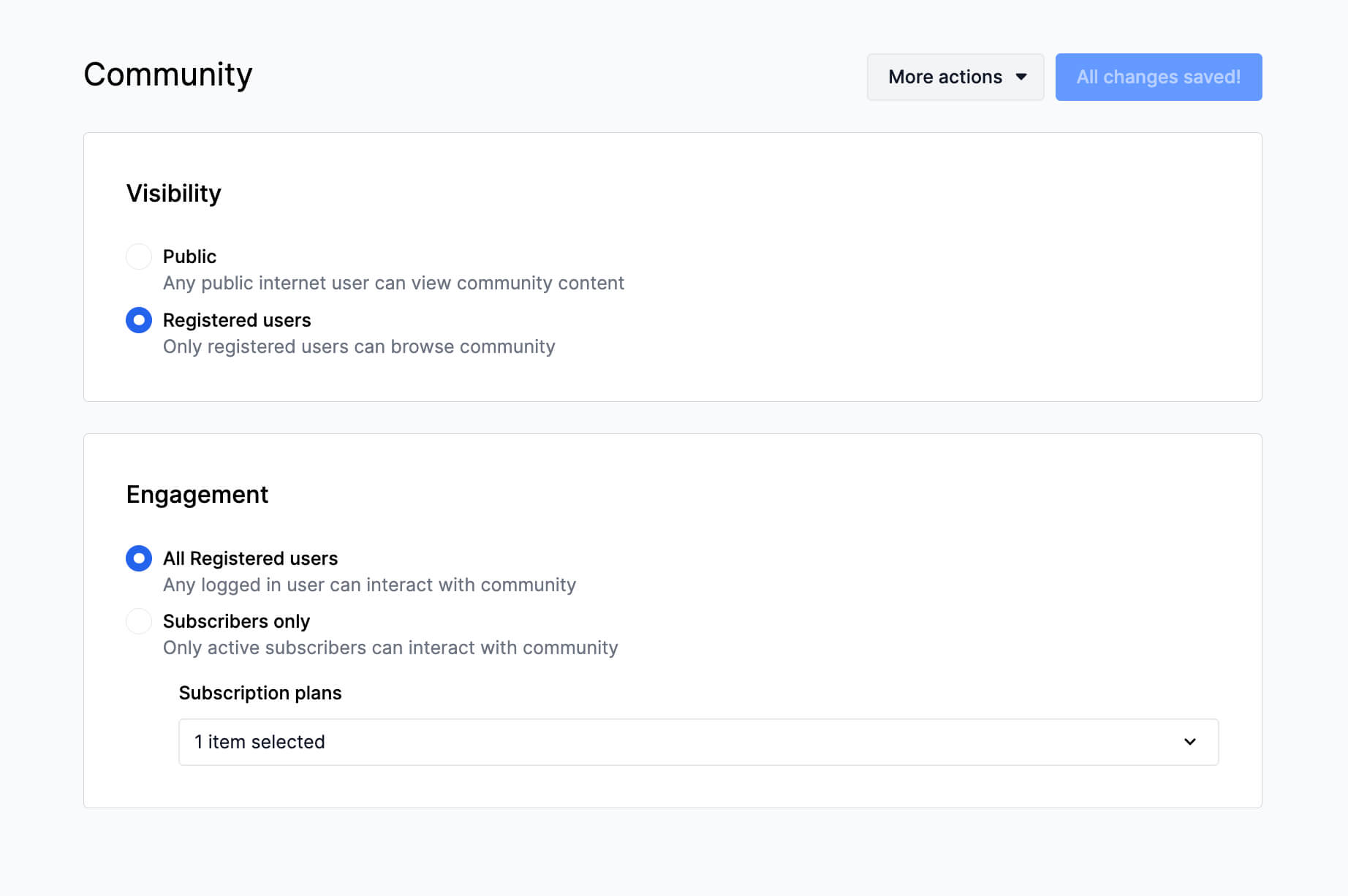
Here you can select who can view and engage with the community, and either activate or disable it by selecting the option and hitting ‘save.’
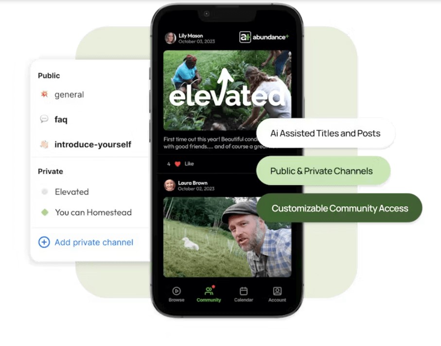
The next step is to add your channels. You might want to have a general one where you can add a pinned welcome post and membership updates and announcements that are relevant to everyone, and then have the others dedicated to specific subjects, skills or themes.
Like Abundance Plus below which also has two private channels for higher-tier members:
At this stage when you’re still building your membership site, there won’t be much to see in your community section until it’s live.
Use this time to prepare a welcome post for your members, which acts as a friendly guide for where to find everything they need and what they should do after joining. Pin this to the top to make it easily accessible and visible for everyone to see.
💡Pro tip: Schedule community posts in advance to provide conversation prompts and keep new members engaged after they join.
The next thing to focus on inside your membership website builder is setting up your marketing tools…
6. Add marketing tools
Now that you’ve got your main pages and features set up, it’s time to set up your marketing tools. If your website platform comes with built-in marketing tools then great! But if not, you can integrate third party tools.
The exact layout of your admin area will vary depending on which platform you’ve built your website on, but you’ll likely have a marketing tab for built-in tools which looks something like this:

To set up these tools, simply click into them and follow the steps inside the tool. Built-in marketing tools are designed to be simple and user friendly, and you’ll usually have access to help guides and videos within your platform to guide you through the process.
The easiest way to integrate third party tools is through adding a plug in for tools you already use (Like Mailchimp for WordPress for example) or using an integration platform like Zapier to connect the apps you want to use.
For now, let’s focus on 3 key marketing tools to prioritize first.
1. Landing pages
Before you can set up offers and marketing funnels, you’ll need a place to send users where they can sign up, find information and redeem offers.
Most website platforms have at least a basic landing page builder which you can use to create pages for a specific purpose from a template. These could include joining offers, a waiting list sign up page or content promotions. Like this example of a seasonal promotion:

2. Marketing funnels
The exact terminology will vary from one platform to the next— they might be called sales funnels or giveaway funnels (like on Uscreen)—but the principle behind them is the same.
Funnels are a series of linked actions that you direct users to take to engage with your messaging and ultimately sign up as a paying member.
Part of their purpose is to get interested users onto your email list, which means you can contact them directly.
5 Lead Magnet Strategies That Actually Convert for Membership Owners

3. Email marketing
This is an important one to prioritize because this is how you’ll contact both your members and the people who have signed up to your email list through the form on your landing pages.
You can schedule emails in advance, to have welcome messages ready when members sign up, and to send out to people who have signed up to your email list. Having this set up before you go live means it will automatically send emails out at the appointed times, making it easier for you to reach your audience.
Once you’ve got these tools set up, it’s time to wrap things up and publish your membership site and do a final check over…
7. Testing
Once everything is set up and you’re ready to go live, ensure you dedicate time to thoroughly test your website and check that everything looks right before publicly announcing your launch.
In my experience, the best way to do this is to have a simple spreadsheet which catalogs every single page on your website (including landing pages and t&cs that aren’t accessible from the main navigation), and create a tab for each action which you can mark as ‘complete’. This ensures that nothing is missed.
For each page, run a technical check:
- Click the buttons to make sure they work
- Check links are going to the right places and watch out for any broken links
- Make sure images and videos are loading properly
Then, a content check:
- Do a final proofread to eliminate any errors
- Make sure you’re happy with how everything looks
We’re all only human and it’s inevitable that mistakes will happen somewhere, and it can be easy to miss them the first time around. If you can, enlist the help of other people to work through this. Choose people who haven’t seen your video membership site yet; a fresh pair of eyes can make all the difference!
💡Pro tip: Wait until your website is live before doing the technical check, as you need to make sure the published links are all working correctly.
Once you have the green light that everything is up-to-standard, you’re finally ready to launch your video membership site!
8. Launch & listen
Once your new membership site is live and officially up-and-running, dedicate time to be active in the community and respond to any questions that come up.
Even if everything is going smoothly, it’s still important to check in with your members and ask for feedback. Give them the opportunity to answer both closed and open questions so you can measure their overall satisfaction with their current experience and find out what else they want to see in your video membership.
Take the time to acknowledge feedback and show your appreciation. Communicate to your members how you’re going to use it to improve, ensuring they feel listened to and that they’re input is valuable.
You can use these insights to edit and reorganize your key pages to improve user engagement and test out different things to see what works.
The most important thing is to listen to what your members have to say and use this to keep improving your video membership experience.
Conclusion and final thoughts
Your membership website is home to all of the essential parts of your business, not just your video content, so it’s important to spend time getting it right.
It caters to two audiences: users coming to your website to browse and learn about your paid membership, and members who are accessing exclusive content behind the paywall.
All of the details, from the layout, imagery, down to the wording of your titles should be working to encourage both types of users to keep engaging—to be a place they enjoy spending time.
Ready to take the first step towards building your video membership site? Find out how Uscreen can bring your vision to life and support you every step of the way.
Build, launch and manage your membership, all in one place.


