


Get all things membership, straight to your inbox.
Learn how to use Uscreen to monetize your content and join the 4,000+ creators who have successfully monetized their video businesses with these 13 features.


Have you outgrown Patreon? Discover Patreon alternatives built for video creators to grow revenue, build a brand and connect with fans without the high fees.
Finding the right membership website builder can be overwhelming. We've done the hard work for you and found the 10 best options.


We break down everything you need to know about DRM video protection and how to keep your gated digital content safe.


We’ve created a 4 week social media plan to help you launch your membership successfully and get your audience excited about signing up.


Looking for the right yoga studio software? Compare top tools for in-person, online & hybrid studios so you can focus on teaching, not admin.


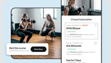
Online fitness can be a great way to earn stable revenue, but the best fitness video monetization method depends on a few factors. Here, we break down 4 different ways to monetize your fitness videos and help you choose the best option for you.
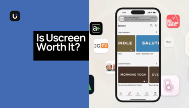
Is Uscreen worth it for your business? We discuss cost, ROI and how to tell if Uscreen is the best fit for you and your video business.

Want to maximize video ad revenue? Follow these 6 steps and advice from real-world creators to help you do just that, on YouTube and beyond.

We share 5 lead magnet strategies that are proven to boost lead conversion and get more people into your membership.

Learn what TVOD is, the pros and cons of this monetization model and how you can make it work for you to boost your revenue stream.
Subscribe to the Uscreen newsletter to receive the latest membership business insights, strategies and promotions straight to your inbox.