It’s hard work creating video after video for your YouTube channel. And when you consistently publish videos and live streams to discover that your viewers only watch for a few seconds, that can be hard to accept.
But here’s what you need to know: boosting your video watch time is just a matter of improving your audience retention.
There are tons of tips for YouTube retention out there, but we want to give you an overall strategy and guide that works with any video platform.
In this article, we’ll discuss:
- Why Audience Retention is an Important Metric
- 3 Tips to Improve YouTube Audience Retention
- TikTok, Reels, and Short Videos: Keeping Viewers Hooked
- 3 Tips on Keeping Live Viewers Engaged
Let’s get into it!
Why Audience Retention is an Important Metric
Audience retention is a metric that measures how long your audience watches your videos. A high audience retention rate means people watch most or the entire video.
Meanwhile, a low audience retention rate indicates that people are leaving before the end.
Why is audience retention necessary?
Because it’s a good indicator of how engaging and entertaining your videos are. If people are sticking around until the end, it means they’re enjoying what they’re watching.
Other benefits of increasing audience retention:
- If viewers stay until the end of the video, your viewers will be able to hear your call to action.
- The algorithm shows your videos on YouTube (and Google) search results to more people.
- More views mean more potential ad revenue.
Now, let’s talk about translating audience retention reports into numbers you can manage and measure.
Audience Retention 101: Get Your Numbers Right
Before recording your next batch of videos, spend some time getting a bird’s eye view of video analytics.
Get Your Baseline Retention Metrics
Getting the baseline establishes a starting point, and you can set specific and realistic goals for each video.
You can ask questions like:
- How many videos have you made in total?
- What is the average watch time on all of those videos?
- Once you’ve done the math, is your baseline data close to the industry benchmarks?
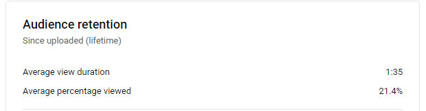
To do this, you need to check your analytics. Look at the average watch time and percentage of people who watch your videos all the way through.
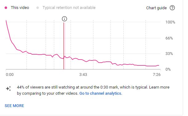
You can find this information in YouTube Analytics or your preferred video platform’s analytics. Here’s an audience retention graph where you’ll know exactly at which point the viewers drop off from the video:
In general, retention metrics are represented by these 2:
- Average View Duration: ideally, the average view duration is around 50% of the total length of the video. For example, it’s a good indicator if the video is 10 minutes long and the average view duration is 5 minutes.
- Average Percentage Viewed: you should aim between 50% to 70%. So, if you have a 10-minute video, ideally, almost 70% of the video has been viewed.
Essentially, both retention metrics came from the same formula: it shows the total watch time divided by the number of video plays.
Note that the longer the video, the higher the average view duration. Plus, the more viewers, the lower the average can get.
For example, a how-to video will naturally have a higher watch time because each video moment is essential to understanding how to achieve a particular goal.
If you’re publishing videos on multiple platforms, you can use Google Sheets to bring the data to one place.
Once you have the numbers, you’ll be able to make a more precise action plan to get a good audience retention rate.
Identify the Key Area To Improve
Once you have the industry benchmark and your baseline data, it’s time to assume why your retention is low. Data provides you with the what, but it’s only the first step.
You need to figure out the why and then the how.
Here are other ways you can figure out why your retention is low:
- Survey your current viewers.
- Ask fellow creators and see if they can provide honest and valuable feedback.
- Watch video creators in your niche and study how they engage their viewers.
At which part of the video do your viewers drop off? Do they leave the video in the first 10 seconds?
You might resist the process of asking questions because it can be scary to hear the answers. But if you want to get to the bottom of things and make improvements, it’s a necessary step.
Once you have the quantitative (your analytics) and qualitative (answers from your viewers) data, it’s time to roll up your sleeves and get the ball rolling.
3 Tips to Improve YouTube Audience Retention (Or Any Long Video)
Let’s assume that you’ve already mastered creating the best thumbnails because you’re getting views. But you have to make sure that what you say in the video matches the thumbnail, especially if you’re using clickbait-y titles.
Now, here are other 3 tips to implement right away in your existing videos or integrate in your editing process:
1. Deliver a Great Intro in the First 15 Seconds
You need to deliver a great hook in the first 15 seconds that will make viewers want to watch the rest of your video.
For example, you can open with a question to which they need an answer.
The best video hooks are:
Pain-pleasure: Identify an uncomfortable audience experience and explain that your video will help them address it.
In our video on YouTube Channel Memberships and why they are broken and what to do instead, we identify the big issue: the major flaw in YouTube Channel Memberships. This happens in the first 3 seconds of the video.
Curiosity-based: Identify an idea (could be a pain point) and position it curiously. This can be a question or statement that piques interest and makes your audience want to see what your video shares about the curious idea.
In Think Media’s video about how to start a YouTube channel in 2024, Sean Cannell shows a whiteboard roadmap with post-it notes covering steps you’ll need to follow. That’s enough to get anyone interested in YouTube channel success curious about what the roadmap looks like. Sean points directly to the roadmap and shares this as the system he’d use in the first 7 seconds of the video.
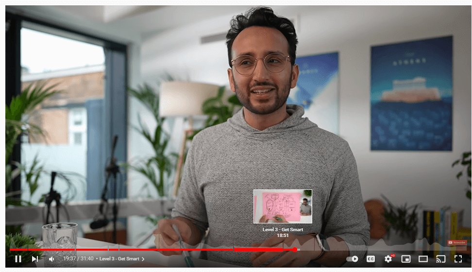
2. Use Video Chapters
This native YouTube feature is easy to implement but can keep viewers engaged for much longer. By breaking up your video into smaller sections, viewers can easily navigate to the parts they want to watch or rewatch.
3. Add Engaging Visuals and “Pattern Interrupts”
Make sure your video has engaging visuals. This can be anything from using on-screen text, highlighting key points, and adding fun animations like GIFs.
If the entire video is just you talking to the camera, most viewers might get bored. Adding a b-roll serves as a “pattern interrupt” to refocus the viewers’ attention and can increase audience retention.
Even just a change in camera angle can be enough to change the scene.
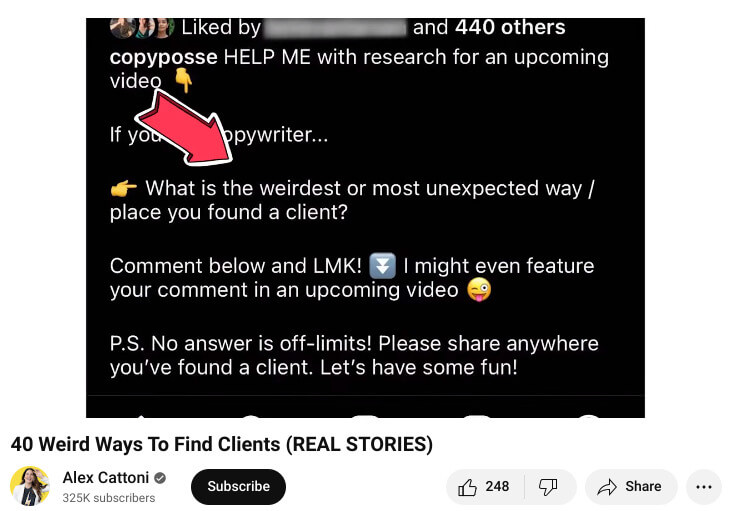
Alex Cattoni, who teaches copywriting to freelance writers, uses fun images as a b-roll to illustrate proof in her videos. Like this one about weird ways to find new clients as a copywriter. Alex shows an image of her asking her community what the weirdest or most unexpected way or place they have found a client.
Alex then shows more images of actual responses from her community. See how easy it is to give audience retention a bump up?
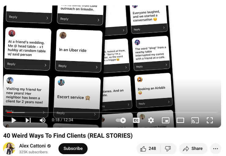
Adding screenshots to parts of your video is smart, especially when you can show participation from your community. Images also pull attention from the typical ‘speaking head’ approach to YouTube videos. People often tire of seeing a person sit and speak. You can boost audience retention on YouTube by introducing images to break the monotony, and they are easy to add to your video editing process.
Short Videos: 3 Tips to Keep Viewers Hooked
Viewers’ attention on YouTube Shorts is a lot shorter. You have to work on the audience’s attention span and figure out how to pack a punch in each video.
4. The Shorter, The Better
That’s why it’s best to hook your audience immediately and offer a payoff within the next 30 seconds. In Mr. Beast’s video on “Feeding A Dog $1 vs $10,000 Steak”, he sets up the hook in 3 seconds. He mentions that he has a $1 and a $10,000 steak, and whichever his dog doesn’t eat, he’ll eat.
This sounds like a simple video without a major value proposition, however, Mr. Beast does an amazing job of getting viewers hooked fast.
Click here to watch the video -> youtube.com/watch?v=ZVt9ZJfWV1c
5. Deliver Value Quickly
Once you have a compelling hook, deliver the value quickly.
How do you exactly spend more to save money? Why do you have to spend more to save money? Show them how a cheap purchase costs you more in the long run. In Mr. Beast’s $1 and $10,000 steak example, he delivers enough value to make viewers watch his YouTube video until the end — even if the video is only 21 seconds long.
3 Tips on Keeping Live Viewers Engaged
Live streams are tricky because they are usually longer than your pre-recorded YouTube videos. So, the percentage of people watching it to the end is usually low.
Here are 3 tips that work with any platform, from YouTube to Facebook to Twitch.
6. Create a Reason for Viewers to Stay and Watch
You’ll need to use different strategies depending on the live stream you’re producing. Are you doing an IRL stream? Or are you on your desktop and screen sharing?
Whatever it is, make sure your viewers have a reason to stay.
For example, if you’re doing a travel tour, you’ll have to showcase the most popular landmark in the later part of the live stream.
This way, people are more likely to stay and watch the “finale.”
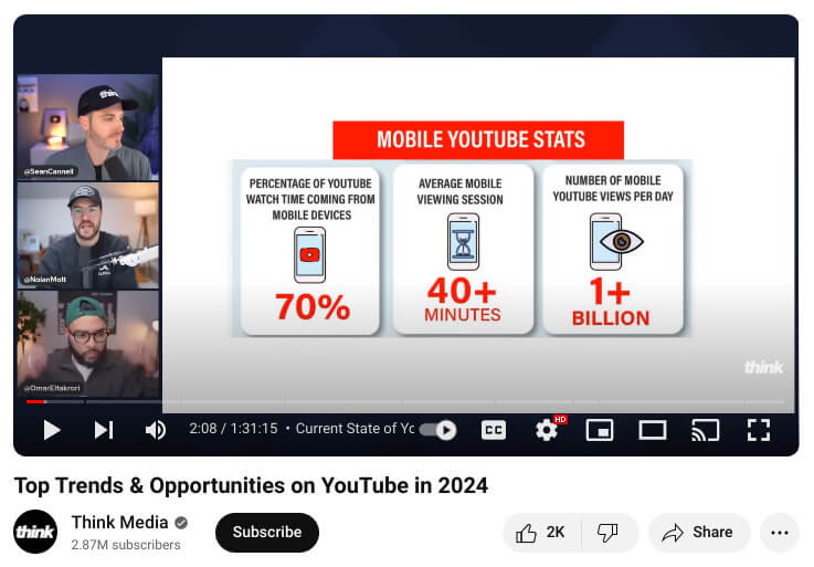
Think Media’s video on the top trends and opportunities on YouTube in 2024 dives straight into the big question that Sean Cannell shares will be answered. As a live video, it is compelling because Sean is joined by two other popular YouTubers who share stats and figures, and explain them.
7. Gamify Engagement
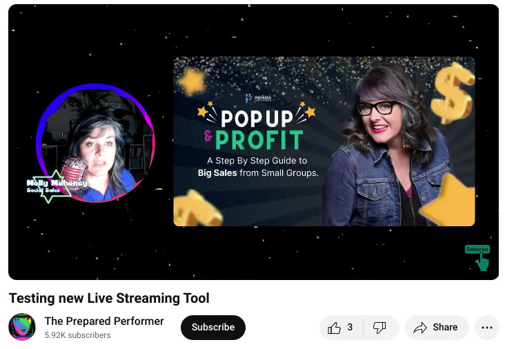
Molly Mahoney, also known as The Prepared Performer, does a great job of keeping her viewers engaged by asking them what “nuggets of wisdom” they’ve learned.
And when they share what they’ve learned in the comment, she gives a variety of prizes, from books to ring lights and even branded coffee mugs.
In this example, Molly shares how a new feature works and challenges her audience to try the feature out too. This idea transforms the experience from a viewing session where Molly is the center of it all to an interactive live stream where viewers are actual participants.
You can find more ways to add games and interactive elements in your next video. Have fun and experiment!
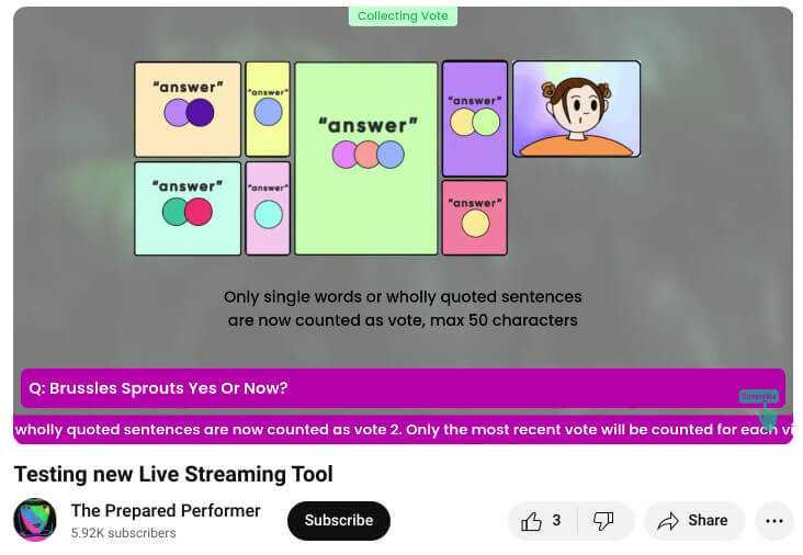
8. Use Visuals Strategically
Use various visuals to help your audience understand and retain the information. If you’re talking about a new product, show pictures or videos of it.
If you’re giving instructions, use infographics or screencasts.
Molly illustrates how easy it is to use visuals by sharing one she created during her livestream.
Wrapping It Up
So, you’ve got 8 actionable tips to implement to improve your audience retention. These aren’t meant to be used all at once, and I recommend that you pace yourself. New tips and tricks take a little time to master, so try one or two on for size first. And when you’ve received enough data to show that they work for you, try a few more out for size.