About 3.7 million new videos are uploaded to YouTube every day. Whether you have a loyal band of subscribers or your channel is just starting to gain traction, one thing is true for all YouTube creators:
Your videos are up against a whole lot of competition.
When your video goes head-to-head with another, how can you make sure that yours wins the click? Your content might be better, but YouTube viewers have no way of knowing that before they click.
So, if you need to win over an audience that’s used to judging a book by its cover, you need a great title and a killer thumbnail.
From best practices to inspiring examples, let’s explore everything you need to master your next thumbnail!
What Makes a Good YouTube Thumbnail
Creating a great thumbnail is one of the best strategies you can use to improve your click-through rate (which determines how many people saw your thumbnail and, of those, how many actually clicked on your video).
Your thumbnail and title are the first impression – and, before clicking, the only impression – people will have of your content. A great thumbnail can guarantee viewers and subscribers, which is why it’s essential to your YouTube marketing funnel strategy and YouTube video creation process.
Moreover, thumbnails can help you build and strengthen your community, which is crucial if you’re putting together a platform to share exclusive content with them.
So, before we begin exploring some of the best YouTube thumbnail tips, we need to answer a pressing question:
What makes a good YouTube thumbnail?
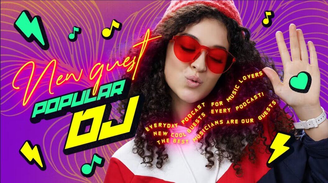
Let’s think about the purpose of a custom thumbnail for YouTube: helping your audience identify one of your videos, communicating what the video is about, and engaging potential viewers so they’ll click on it.
With that in mind, here are 7 factors to consider every time you make a new thumbnail (be it on YouTube, social media, streaming services, video membership services, or other platforms):
- Clarity: People need to understand what the video is about instantly.
- Quality: Is the resolution as expected? Is it optimized? Does it look good on different devices? What about the size and design style? Follow YouTube’s recommendations so you can present a high-quality thumbnail.
- Competitiveness: How does your thumbnail stand out from competing thumbnails?
- Accuracy: A misleading or clickbait-y thumbnail will only work against you. Ensure your thumbnail is true so your audience won’t be disappointed or lose interest in you.
- Wording: In this case, “word economy” is the name of the game. The text in the thumbnail should be short and sweet to avoid overwhelming the design.
- Graphics: The colors, designs, placements, and other graphic elements should be working together to boost the thumbnail (more on that later).
- Branding: Does it go well with your content, visual identity, target audience, and more? Make sure it does! (more on that later).
Stand Out and Stay True to Your Brand
Now that we’ve covered all of the things that objectively make a great thumbnail, let’s talk about something a bit more subjective: your branding.
Your YouTube channel name, your audience, and your content. These are all totally unique to you and will heavily inform what a “good” thumbnail is by your standards.
When you’re figuring out your next thumbnail, there are a few things to consider in terms of your brand:
- Your visual identity: From your logo to the colors and typographies you use, and even the placement of the different elements. A strong visual identity can help you to stand out and become more recognizable to your audience.
- Your content and tone: Are you a comedy YouTube channel? Do you create educational videos? Your content and the tone you approach it with will definitely sway your thumbnail decisions.
- Your target audience: A child won’t engage with a thumbnail meant for an older user. A gamer probably won’t click on a thumbnail featuring beauty products and vice versa.
There are other outside factors you should be aware of as you create a thumbnail. Look over the trends at the moment and decide if they can work for you. Similarly, you should keep up with YouTube guidelines to avoid getting into trouble.
Lastly, run tests. A/B testing can help you figure out what your audience responds to, and help make each of your thumbnails as successful as possible.
8 Amazing YouTube Thumbnail Ideas
Okay, now it’s time to get into the fun stuff! Let’s learn how to create a YouTube thumbnail design.
From visual elements to YouTube thumbnail best practices, plus how you can use them to maximize your click-through rate…
Here are 8 amazing YouTube thumbnail ideas:
1. Simply Busy
You have limited space to get your video’s subject across. This means that every pixel is of the essence. As a result, thumbnails tend to seem busier nowadays.
An important thing to note, however, is that there can’t be chaos. A messy thumbnail will only confuse your audience and your message will be lost.
In a way, you need to strike the right balance between a busy and a simple design if you’re learning how to create a YouTube thumbnail design. There are plenty of elements, but each is organized properly to work together.
This is one of the YouTube thumbnail best practices to try.

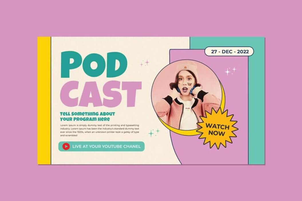
This is a YouTube thumbnail example from Envato Elements illustrating how your thumbnail can be busy in a smart way.
The YouTube thumbnail example above uses shapes, colors, different typographies, and images.
For all intents and purposes, this is a busy design, yet, the eye can rest in some places. Moreover, there’s a clear focal point that viewers should pay attention to.
2. Color Me Balanced
Color can make or break your YouTube thumbnail design. It’s the difference between captivating and boring. This is why you must sit down and have a good think about color choice as you create a thumbnail.
As a general rule, you should use colors that match your brand. Earlier on, we mentioned that you need a strong visual identity, so find colors that complement it.
Trends can also influence the colors of your thumbnail. Analyze what other channels are doing, the fashion at the moment, the Pantone Color of the Year, and more. Inspiration can be the key to figuring out your color story.
Finally, keep your hues balanced. You may want to stick to 4 main colors max to avoid exhausting your viewers. In any case, it’s good to use a mixture of bright colors and a couple that are more toned down so the design looks and feels harmonious.

Use a balanced mixture of colors that represent your brand accurately.
3. Uniquely You
As the saying goes, “Be yourself, everybody else is taken.” Part of your visual identity involves having a personality that will help the users tell you apart from other creators.
To that end:
- Always design your custom thumbnail for YouTube with your brand in mind.
- Have an identifier. This can be a character, person, logo, or other element that users will recognize right away.
- Show your logo. A common theme is placing the logo somewhere in the thumbnail, especially in the bottom left corner, so it catches the eye quickly.
- Be consistent. You need to stick to your visual identity as much as possible. Every thumbnail should portray what the video is about, but there should be a clear cohesiveness between the thumbnails in your channel.

A strong and unique visual identity will help your audience recognize you instantly.
4. Fun With Fonts
The fonts you use can communicate a lot (and we’re not only talking about what the text says). Since space is limited, typography is another graphic element you can employ to portray your videos accurately.
For this reason, you should find a font that is recognizable and fits your brand. It’s recommended that you keep it from thumbnail to thumbnail.
Right now, creative and original fonts are all the rage, precisely because they can be so distinctive. Find yours and go for it.
But before you nail down your own original font, keep these things in mind as you’re working out how to make thumbnails for YouTube:
- Your fonts should be readable at a glance.
- While using more than 1 font style can spruce up your design, limit them to 3 different fonts to avoid being all over the place.
- Increase the font sizes so they can be read easily.

Readable, recognizable, big, and limited fonts will work best.
5. Get Into Shape
Shapes and graphics are your friends in your YouTube thumbnail design.
Circles, squares, lines, graphics, patterned backgrounds, and designs can make your thumbnails much more captivating. This will increase their ability to stand out and command the attention of any eyes scrolling through YouTube.
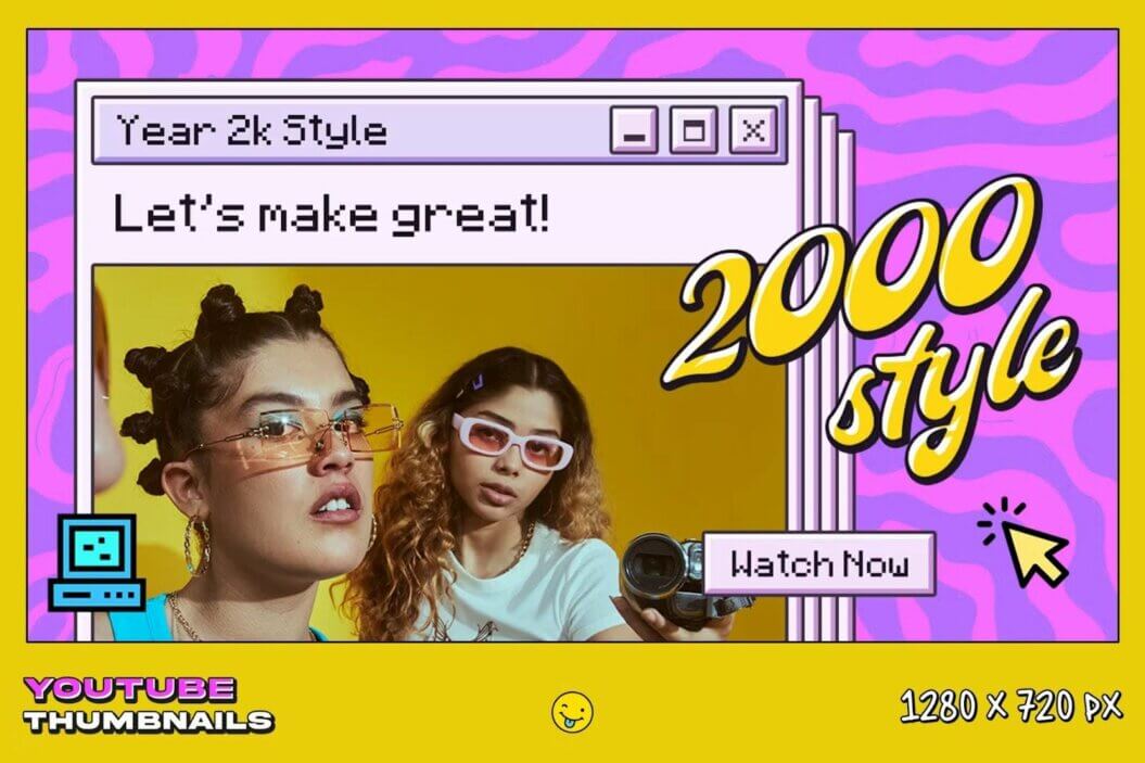
With this example, you can make a YouTube thumbnail for a video about Y2k with shapes and graphics that represent it.
6. In the Spotlight
The first YouTube thumbnail idea we shared was all about having a busy design filled with information. While that still holds true, certain aspects deserve special attention as you create a thumbnail.
To bring those elements forward and into the spotlight, you need to highlight them. You can do this with shapes, colored blocks of text, size, or other similar strategies.
In any case, make sure you decide what section, image, title, or words should be the focal point and work on emphasizing them.

Choose a keyword or aspect of your thumbnail and emphasize it.
7. Photo Focus
A very popular trend among YouTube thumbnails is to use big images to illustrate what your video is about. After all, YouTube is a visual platform, and you need to get your point across in just a few seconds.
Be it a still from a video, a photo of the main subject, one of the characters in your video, or another, a prominent image can share your video’s subject in a split second. And isn’t that what YouTube thumbnails are about?

A quality, big image can charm viewers and draw them in, like in this YouTube thumbnail example.
8. Go Big or Go Home
Lastly, a thumbnail is not the time to be using understated designs.
The trend at the moment is maximalism and going all out with your YouTube thumbnail design. After all, you need to stand out in a sea of other highly flashy thumbnail designs.
Apply all of the YouTube thumbnail tips mentioned above, but make them bigger! Big fonts, big images, big shapes, and big everything, so you can enjoy a brag-worthy click-through rate.

Adopt a “go big or go home” mentality as you create YouTube thumbnails.
Conclusion
The importance of an awesome custom thumbnail for YouTube can’t be understated. It can help you stand out from the crowd, reach your audience, and get the views you deserve.
Furthermore, it can allow you to build your community and even get to a point where you can create exclusive video content for your audience.
There are many things you can do if you’re learning how to make thumbnails for YouTube. Play with graphics, images, typographies, placements, sizing, and other elements to achieve your goals.
And remember to do some A/B testing to find out what works for you and ensure you make the most out of your YouTube thumbnail design!


