For the longest time, catalog pages were kind of the bane of my existence. They were always something we kept coming back to fix and optimize but never seemed to get 100% right.
UX and store-admin needs were so conflicting, it was hard for us to figure out what the right SVOD catalog structure is.
At the end of the day, our goal was to give our creators’ users the best browsing experience possible. We knew it was possible, we just had to figure out how.
And I’m proud to say, we figured it out: we launched Uscreen’s best default SVOD catalog structure yet!
Uscreen users and members of the VOD community haven been intrigued by our choices, wondering why we decided to build it this way.
Let me tell you the story of the ideal SVOD catalog.
First Try
We initially decided to create a catalog that shows all content in one place, and give the users the option to search or filter by category or author, and added a search bar. Content appeared chronologically, from newest to oldest.
What happened after was interesting: organizing content basically became a nightmare for Uscreen publishers. They felt stuck because they could only show off fresh content at the top and didn’t have the ability to push the content they wanted to promote up to the top instead.
However, a more interesting challenge was actually the clients’ user experience (UX). We realized that users were just seeing a bunch of content with no structure or logic, which was confusing them to no end.
To get to the bottom of this, we used Hotjar, our favorite tool we like to use to figure out user behavior on sites.
We created heat-maps and recordings to see how users interact with typical stores, and we realized it took users a very long time on the catalog page before choosing an item to watch, or even clicking the category drop down. Almost no one was using the author or sorting filter, and the catalog was simply not user-friendly.
So whatever we did there was wrong.
Think, think, think!
Uscreen has a vast variety of customization options for developers, meaning if a store admin knows how to code, they can change the structure of any page they want, including the catalog page. We took this to our advantage when we were trying to find the best SVOD catalog structure out there.
We paid special attention to Hotjar recordings of stores with custom catalogs in the hopes that some Uscreen creators have figured out the perfect catalog structure themselves.
No luck there either – but we still learned a very interesting lesson.
Take the following customized catalog, for instance:
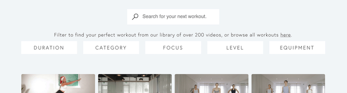
Recordings of this and similar SVOD catalogs show that users initially struggled with this structure just as much as they struggled with Uscreen’s default SVOD catalog. The reason for that is simple:
It’s overwhelming.
Users will first land on a catalog page that has so much (awesome) content and not know where to begin. But after they spend some time on the page, they seem to figure out how to look for what they want:
Step 1:
Users will land on the catalog page and add their first filter, which was almost always category.
Step 2:
After narrowing down to the kind of content they want, they then applied a second filter by, for instance, duration, focus, level or equipment.
In other words: People need at least two layers of filtering to find what they’re looking for.
And you know what? That makes total sense. When searching, we often need to narrow our endless options down to a specific topic before we filter further by more specific measurements, such as duration, author, or level of intensity.
Voila! We found our SVOD catalog gem.
Now, back to the big players
Ok so we cracked the secret: users need two layers of filters for the best UX. But what does that look like in real life? How do we implement this best without confusing our users?
So we turned to the big guys.
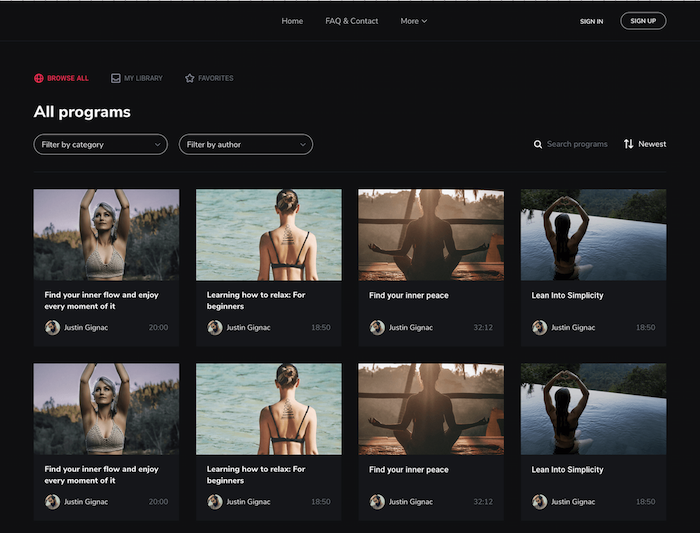
Let’s take Skillshare, a great example of a successful SVOD catalog in our books.
When you first land on the Skillshare catalog, the first thing you’re prompted to do is to pick a category. After you narrow your options down to that specific topic you want, you can then, and only then, see the filters across the top of the catalog. Check it out:
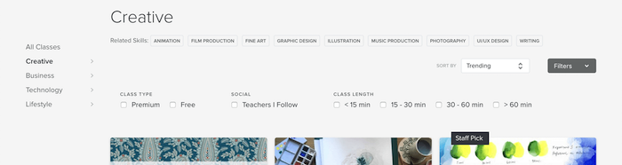
This workflow seems consistent with the user-behavior on our catalog.
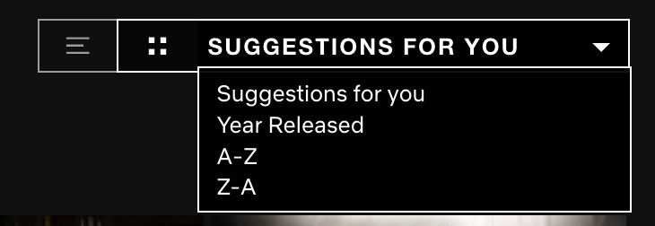
To be extra sure, we check out what Netflix was up to. Turns out, they’re doing the same thing with their catalogs:
- First step: categories and search
- Second step: additional filter options
This, to say the least, was very exciting to finally figure out!
Speed is everything
So now that we’d figured out exactly what we needed to build, it was time for us to make it come to life.
Building it was easy. Making sure it doesn’t slow down the entire user experience… now there’s a challenge.
Speed is a huge factor of UX – one that’s actually underestimated by a lot of creators on and off Uscreen. Time-to-interact, which is the point when a user can interact with a webpage element once the page has rendered, could turn a user off if it’s too long.
We needed to find the best way of showcasing content on a catalog without making users wait a hundred years for them to load (who’s got the time?!).
So to make sure that doesn’t happen to your store, we used animation in our catalog the same way Netflix does it, using only CSS. In other words, we created lightweight animations that don’t require a tone of data to load so it doesn’t slow down your catalog pages as the video thumbnails load. So no matter what kind of device or network your user is on, we can always guarantee speedy access to your content.
We won’t stop there: Our dev team is working hard to make sure we’re delivering constant improvements to your catalog. We are trying to make our Javascript bundle as small as possible for our next catalog update release, so it only gets faster from here.
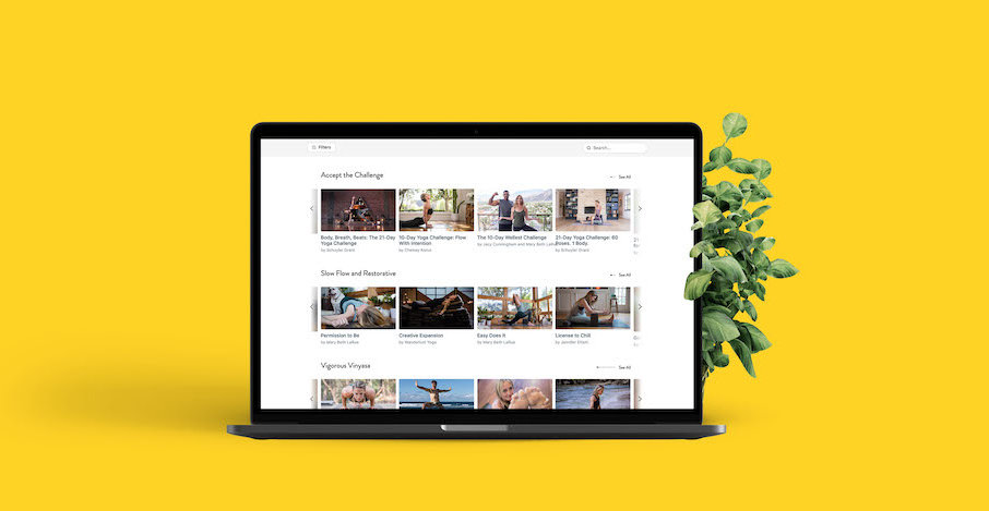
A catalog star is born!
Welcome to the future!
Weeks of research, countless attempts, and millions of user-sessions later, we were finally ready to release the best version of our SVOD catalog yet.
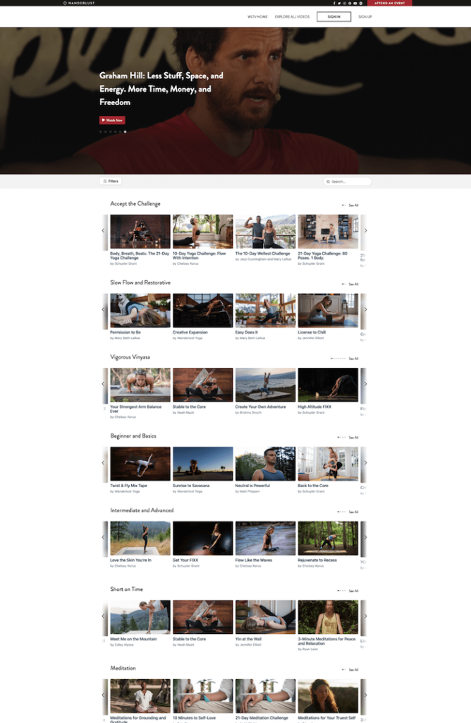
Now, you have a beautiful and fully UX’ed catalog page for your content to shine and please your users.
First, you have a top carousel-banner with the option to add specific images and videos to showcase the content of your choice.
Then, you have a list of Netflix-like categories with pre-grouped content, so your users can automatically start browsing the topics of their choice. Users can hit “See All” to load an entire category to browse through.
For your typical search-engine browsing, users can use the search bar to look for the content they want using keywords.
And last but definitely not least, users can search these categories by narrowing their choices further and further using the additional filters, which you can custom-set in your admin area.
The perfect SVOD catalog does exist
And there you have it! The perfect SVOD catalog is not just a legend – it’s right at your fingertips. You can now offer your users the most seamless browsing experience and keep them on your platform for as long as possible.
We had a lot of fun figuring this out and bringing it straight to your stores—and for that, we’re grateful.
If you need help installing the new catalog to your store, you can find step-by-step instructions in our help center.
Care for an on-demand demo?