We’ve recently made some exciting improvements to your platforms’ buying journey with a big focus on converting high value users.
To start, we’ve done a deep dive into the checkout flow users follow and we’re focusing on 2 key paths:
- purchasing a membership from your homepage.
- making a purchase from your video catalog.
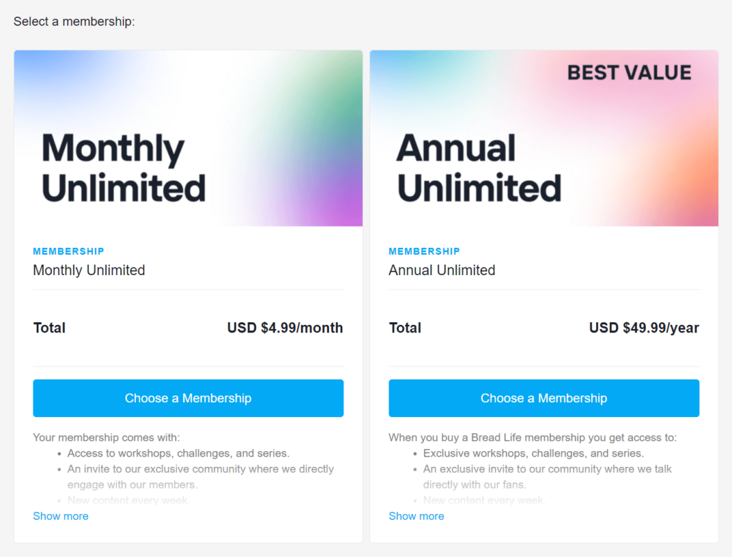
For users purchasing a membership: the page (found at [yoursitename.com/join]) has been redesigned with better communication on what your memberships include.
This attracts higher quality users and reduces your churn risk, because a well-informed user is less likely to churn.
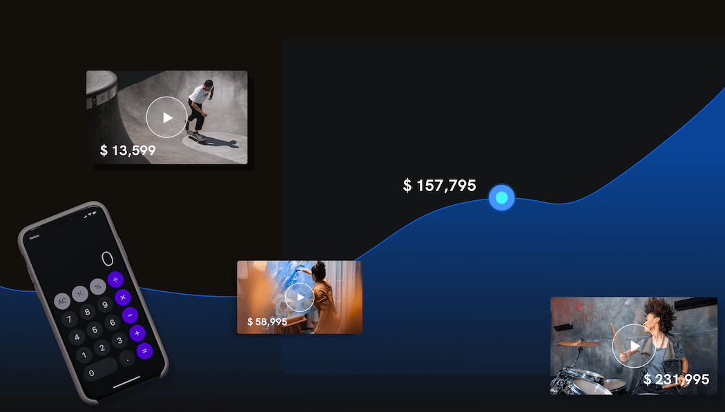
For users browsing your catalog to make a purchase: we made the checkout process simpler and shorter by eliminating the extra step where buyers would navigate to another page to choose their purchase option.
Now, they can see the purchase options directly from the video page. The shorter checkout process drives users to the new account creation/purchase step more quickly.
In our previous buying journey, account creation and payment details existed in a 2 page path. Now, they exist on a single page.
By combining both steps into 1 page, we’ve reduced the rate of users who abandoned their cart midway through a purchase.
We’re really excited for you to test out the new experience where you can expect higher conversions and higher-quality users.